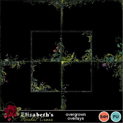
Have you
ever played around with edge overlays? I use them a TON for my own layouts.
They add so much visual interest to a background without covering the central
focus, and can change the entire ‘feel’ of your page. You can mix and match
them, stack, recolour, rotate them, mirror them – there are just so many
possibilities with this kind of embellishment!
Here is
an example of how an edge overlay makes this otherwise rather flat background
come alive:

An
overlay on different backgrounds changes things up yet again, so you can use
them over and over. In this example, even without mirroring, rotating,
recoloring, or stacking, you still have three unique new backgrounds:

Sometimes
an edge overlay is almost the only embellishment you need to enhance your
special photos or complete a page of journaling:


They work
equally well on graphic style or paper style layouts, and you never need to add
a drop shadow to an overlay edge – it is there simply to enhance and change the
look of your background or photo. Make sure to add it as the layer directly
above your background or full-page sized photo, then add shadowed elements on
top of it:


You can
even use them with dramatic effect on plain black or white as a background – no
scrapbooking ‘paper’ needed:


Many of
my kits contain overlay edges which are not obvious in the sample images, but you
can find packs of overlay edges in the ‘embellishment’ category. Mine come in sets of five and occasionally I
will include a bonus background. Here
are a few of my favorites:

I hope
you decide to have a play with edge overlays! To me they are so much fun!
Thanks
for stopping by – and come by my facebook designer page for the monthly blog
train freebies! https://www.facebook.com/ElizabethsMarketCross/
Elizabeth


2 comments:
Great tip, and so well presented, thank you so much :)
Awesome tip, Elizabeth! Thank you! I love how these overlays can add so much visual interest to a layout! I need to use them more.
Post a Comment