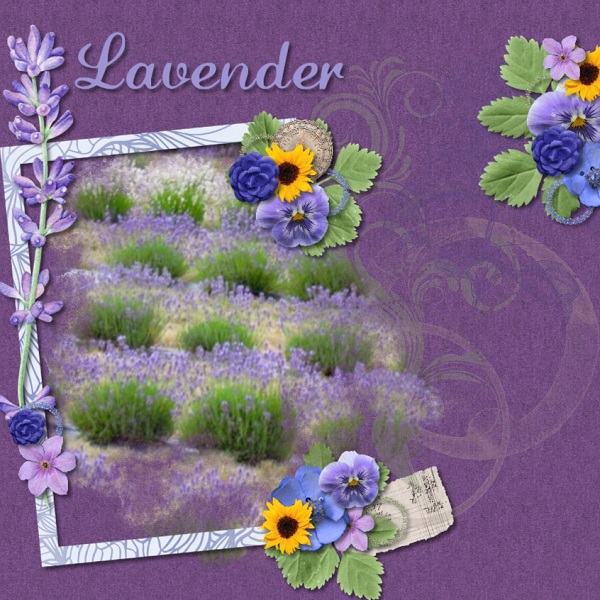
Applied to scrapbooking, it means your layout will be more appealing if you apply the Rule of Threes.
Example #1: visually break the canvas space of your layout into three zones, as Maureen does in this layout. One third of the vertical space on the right and two thirds of it on the left. This is a fairly straight forward way of applying the rule.
Example #2: here Pia uses three photos/ephemera in a grouping, It is very pleasing to look at. AND when you add in the two clusters, she is still using an odd number.

Example #3: Renee's layout uses three photos in a grouping and she uses the "white space" of the layout as well. One third of the canvas is white space and two thirds is adorned with clusters and photos. The result is pleasing to the eye.
All of these layouts were created with my newest collection: Provence Lavender, just released and on sale in my store.
I hope you enjoyed this exposure to the "Rule of Thirds". Tomorrow, designer friend Silke will provide you with a freebie and more thoughts about this very important design tip. We both agree
it is one of the most important aspects of good design.
Happy Scrapping,
Diane


No comments:
Post a Comment