Have you ever looked at layouts that others have done and thought to yourself, "Wow that's so pretty and realistic, wish I could do that". Well one trick that a lot of people use is so simple, but adds so much to any layout or scrap page that once you use it you'll never stop.
Shadows...they are an important element that every designer should know how to use. It adds just a little something that can make your work look so good. Plus it's so easy. Just do it once and you've mastered it. Using the My Memories Software, shadows are pretty much done for you. Just click the shadow button.
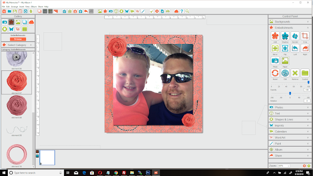
Ok, let's start with any project you have. Get your background paper, your photo and add your elements. Here is mine..

It's very simple. Just a photo of my cousins, some strings (because my baby cousin says she collects string) and a few paper flowers. I tried to match the background paper with her shirt the best I could. I used my mini kit from the Determination Bundle. Just click the photo below to use the same kit.
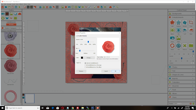
Now comes the easy part. I have my arrow over the shading button in the below photo.

Select any of the elements on your page, doesn't matter which one. Now just click that and look at the settings I have in the following photo and set yours to the same. Then just click ok.

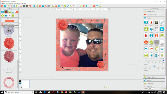
Once you click ok, you've done it. Added shadows to your layout to give it a perfect touch of you. It makes whatever you've added shadow to a special look. It allows the element or photo to look almost raised off the background a slight bit. Continue doing that to what ever you think needs it. I personally use shadows on everything just about. Here is my finished page.

There you go. YOU DID IT!!! I personally love shadows and love the look they give to any project. They are so super easy to use and really a must use tool for any designer. I hope I made this easy enough for everyone and you enjoy working with your shadows now as much as I do. Have a great day guys and many blessings to you all!!!


No comments:
Post a Comment