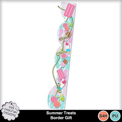
Back again, fellow scrappers!! Today I'm going to talk to you about the Design Principle of Repetition. Repetition is just that… the principle of using an element or elements over and over again to create an interesting pattern or design. This is very easy to achieve. You just choose an element or a few elements and then place them either randomly or strategically on the document until you get the desired look you are going for.
The paper and elements I’m using for this post are all from my Summer Treats Collection that’s now available in the Digi Deborah Designs shoppe at my Memories. So first, let’s start with just a background paper clipped to a border shape:

Next we’re going to add the first element and duplicate, rotate it and resize it… it’s the popsicle:

Then we will add the fudgesicles and the bomb pops (perfect for these scorching hot summer days, right?):


and then, let’s add some of the cherries:

Now it has taken a very interesting design, but it still looks like it’s missing a little something. So, lastly, we’re going to take that gorgeous piece of green string from the collection and add it to the border:

Because the string has the repetition of the bows, it also ties in perfectly to the concept I’m showing you today. we will want to adjust the layering of the string and the ice cream treats so the bows look right and aren’t covered up by the elements. And now I’m pretty happy with what I’ve put together here. I’ve included this border as a gift for you to enjoy! Just click on the preview to go to the product:
And please come join the DigiDeb Designs Fans, Fun and FREEBIES Facebook group for more, what else? FREEBIES!!
Here’s just a couple of the designs that are over there right now:


Thanks so much for stopping by today and I’ll see you next month for the next installment of Eye on Design!! In the meantime,
HAPPY SCRAPPING!!


No comments:
Post a Comment