
Hi, Friends!
I have an idea for you today that:
1. is easy,
2. will give your pages a finished look, and
3. will literally "frame" your layouts.
I'll show you a variety of pages created by several of my wonderful Creative Team ladies using different style kits. The pages themselves are amazing, but we'll focus this time on the outside inch or so of the layouts. I hope you see a few ways to frame your pages that you'd like to try.
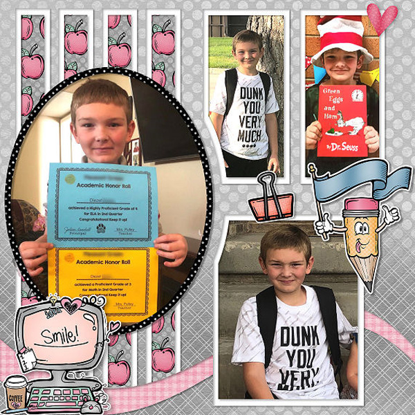
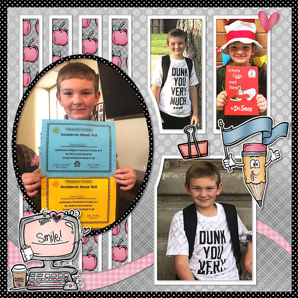
This is a great layout by Lana, but look how much better it looks when she layers a contrasting paper below the gray.
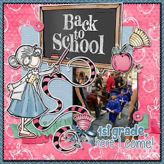
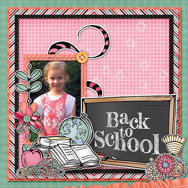
Yvonne and Penny chose 3 contrasting papers for their page frames. This technique really make their photos and clusters pop and finished their pages.
Look closely and you'll see that Kabra gave her page a larger frame using a total of 5 background papers.
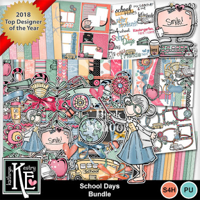
All of these pages were made with School Days.
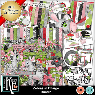
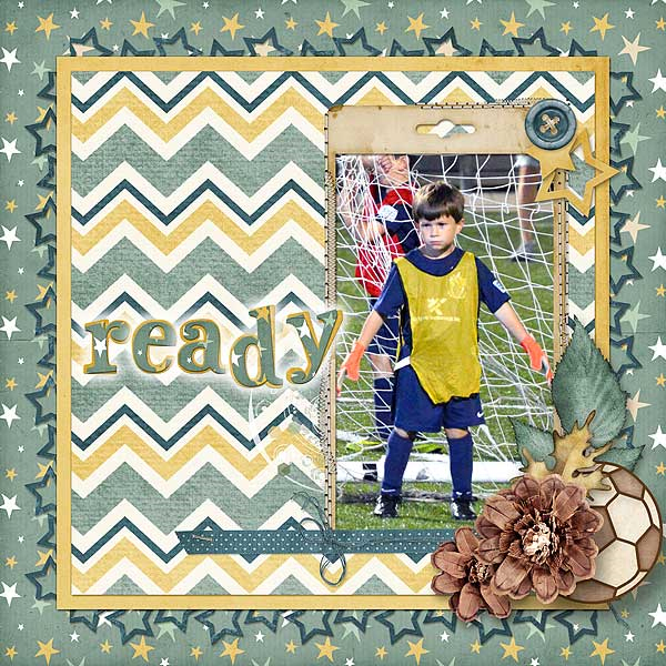
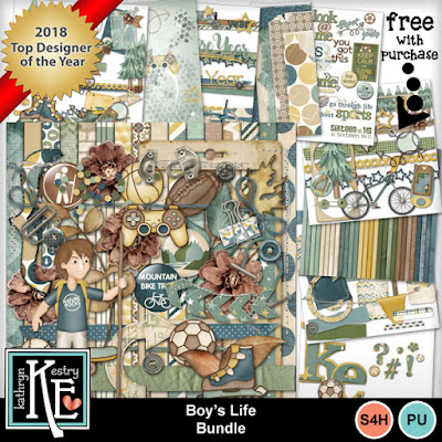
Here are 2 more pages by Kabra with large eye-catching frames. The kits used are Zebras in Charge and Boy's Life.
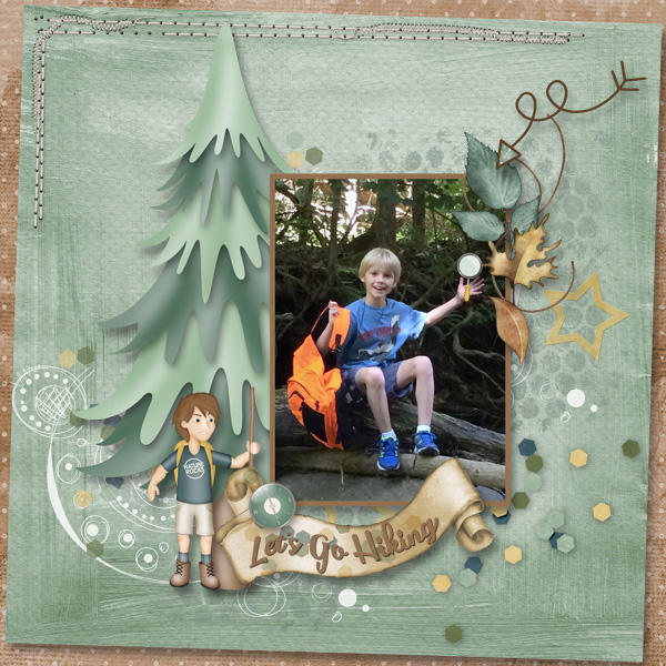
Another Page Frame technique, also with Boy's Life, is to slant the top paper just a bit as Donna did in this boy page. She added stitches in the top corner, a nice finishing touch.
Try rounding the corners of the papers that you layer above the background paper. I love how Janie's page looks with The Good Life.
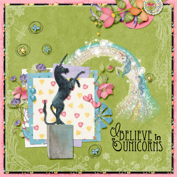
More examples of Page Frames are in these two Unicorn Magic pages by Yvonne and Pia. I really think the contrasting pink frames add a lot to their pages.
I challenge you to create a page frame for your next layout and see if it makes your page even better!






No comments:
Post a Comment