I know you are like most scrapbookers and have a ton of supplies. It’s so fun collecting the latest and greatest new products, right? I challenge you this month to take a look at what you currently have in your stash and think of ways to give them a new twist.
One of my favorite things to do is to focus on a particular color or two in a collection and use all of the papers & elements in that color family. It can give an old kit a new feel when you do this!
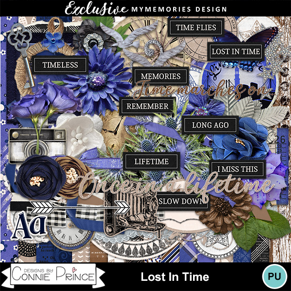
First up is a layout that was created using my Lost In Time Collection which is pretty colorful, with pops and blues and purples. Let me show you the one!
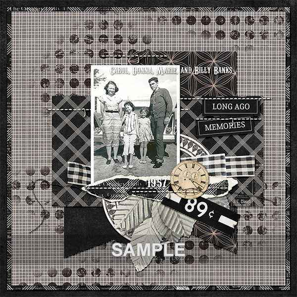
It’s pretty bold and bright, right? But wait! It doesn’t have to be. Take a look at this beautiful layout using Lost In Time that just focuses on the black / white aspect!
I adore the monochromatic feel and it really lets the photo take center stage by dialing down the color!
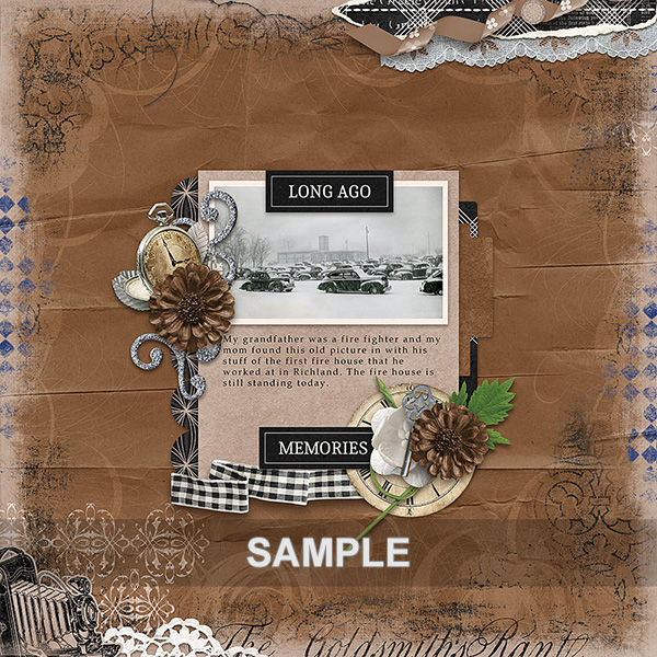
This beautiful winter layout is also using Lost In Time, but this time she focuses on browns and black.
I think the centered design with just a little grunge around the border of the page is absolutely stunning!
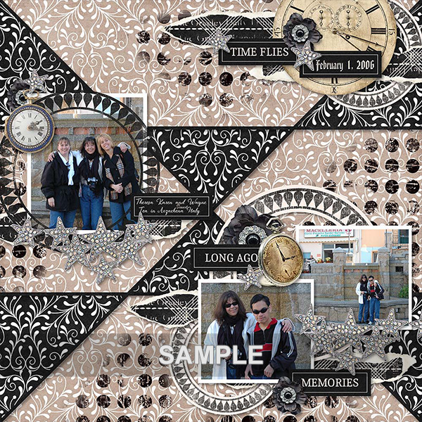
The next layout focuses on the lighter tans & blacks. I love the patchwork paper, the patterns really add so much interest!
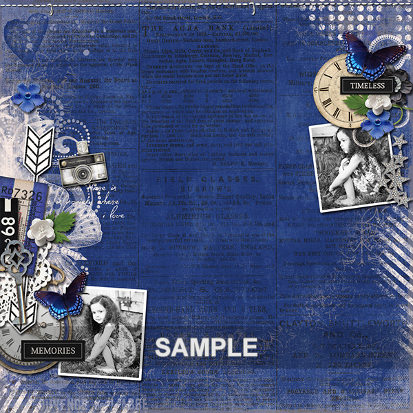
The next beauty focused on the periwinkle blue and by making her photos black and white she really created a masterpiece of a layout! The splash of white really adds a nice finishing touch!
This technique makes it so much easier to match kits to photos and really set the tone of the page! I hope you’ll take a look at your stash and give this a try!
Wishing you a very Happy New Year!
Connie Prince


No comments:
Post a Comment